
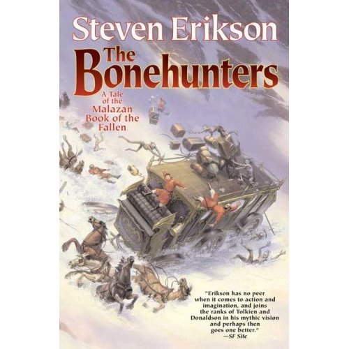
This is the US cover art for Steven Erikson's The Bonehunters.
Unbelievable. Atrocious.
And I thought the US cover art for Gardens of the Moon was as crappy as it got. . .
All of a sudden, Rothfuss' "gay cover" -- as it is now affectionately known -- for The Name of the Wind doesn't look that bad.
If Tor Books wish to increase Erikson's popularity in the USA, covers like these are making it awfully difficult for potential readers to pick up the novel at a bookstore. I mean, give me a break!:-(
Just scroll down a bit to see Transworld's original UK cover art. Interestingly enough, Transworld decided to change the covers of every Malazan book prior to The Bonehunters' paperback release. . .

24 commentaires:
That is the Tiny Tim of front covers, that is.
What exactly is the problem with the cover? And how is it any worse than TOR's GotM cover?
I must admit, I didn't think the cover was too bad either. But once I looked at the original cover, I kind of see your point.
I don't buy books based on the cover art; though I will admit it can be a great attention grabber.
I'll touch on what SQT said a little further.
While you'll never find me claiming TOR's covers are superior to the UK covers, I really don't think this cover is that bad.
And I certainly don't think the cover art will deter readers from picking up the books. If that were the case, how in gods name did Robert Jordan become a bestseller? I mean, the Wheel of Time has some of the most horrible covers seen in fantasy. Actually, scratch that. Look at almost ANY TOR author - they ALL have shitty artwork. And yet, their books sell.
In short, while I preferred the UK covers (at least the original ones, before they decided to change mid-series) I don't really mind this cover, nor do I think it will have any impact on sales.
Well, it's bad since I suppose doesn't represent the content at all. But probably people will be less ashamed to be reading this on in public than GotM or the MoI MMPB.
I mean, let's be honest: That's one crappy cover.
I won't dispute the importance of that particular scene, but come on...
I know for sure that the German covers of his books are totally stupid (and out of context), but Steven Erikson is perhaps one of the biggest fantasy authors...EVAR...but he won't get the audience that he's REALLY deserving with covers like that one...
It's a shame. It's a shame...
Post scriptum: Sorry for not telling my name, but Google wants to know too much...
I actually like the artwork in of itself - it reminds me of those old Tintin comics for some reason. Having said that it seems utterly unsuited to the malazan books in general and the bonehunters in particular. After all, Trull Sengar doesn't wander around going "Blistering barnacles, my people are being led by a madman!"
Not to be overly politically correct but who on earth is refering to Rothfuss' David Bowie the early cover as "gay" in an affectionate manner? Ann Coulter? I can see calling it the Fabio-lite cover as one reviewer was tickled pink over coining.
Maybe even the Chippendale cover as another blogger for books opted for. But what on earth makes anyone think a gay man is going to find that any more attractive than, say a straight woman.
Most of my gay friends that read fantasy find it tacky and rather ugly. Now that feeds into a stereotype.
And The Bonehunters cover is one of the first covers that I find can truly support the silly UK versus US argument. One of the few, but an incredibly damning point for the UK.
It looks like the book deals with the Old American West if you just glance at it quickly. But maybe that is the point? To be so incredibly out of place on the scifi/fantasy sheleves when facing out that it makes the customer pause and look?
That cover looks like a train wreck. I'm sorry... I mean a carriage wreck. :)
But yeah, I agree. The UK one loooks much better. Having never read Erickson (sorry, don't want to start another in-progress 10 volume series), that first cover wouldn't convince me to.
The impression the cover gives is one of slapstick adventure with a dash of stereotypical fantasy.
The cover looks more like a book about two russians going on an archaelogical dig :P
Oh, and is there anyway to find out what Erikson himself thinks of this?
Well, they say "Don't judge a book by it's cover"...
But if some random customer will be convinced to buy a book with Santa's wrecked carriage on it is an entirely different story...
I just saw the full cover art on malazanempire.com, and it's not as bad as I thought. You also have Paran riding his horse, yet he will appear on the back cover.
Todd Lockwood is a gifted artist, there is no doubt about it. But he paints what he's contracted to do.
There is no denying the importance of the scene depicted on the cover. But it does look like a Discworld cover, not a Malazan cover.
As Abyss stated on malazanempire.com, it doesn't convey the brilliant scope associated with the series. None of the US covers do, truth to tell.
Tor Books have the talent and the resources to do much better than this. With more marketing (and better cover to entice readers to pick up the books), I'm persuaded that Erikson could be as popular as authors like Feist, Brooks and Williams in North America.
Sadly, this cover for THE BONEHUNTERS will not help matters much...
Patrick, you totally stole my Discworld comparison. That cover is inappropriate for any fantasy novel not written by Terry Pratchett.
It's bad...Nice artwork, but it doesn't begin to sell me the book. I read comedy in that cover...and maybe Erikson turned the series...but I doubt it.
Thats pretty bad. Not as bad as GOTM or the "gay" cover though
Thats pretty bad but not as bad as GOTM or the "gay "cover
This cover fails on a number of levels. Since Erikson is perhaps the finest modern writer of epic fantay, this cover ought to represent that. Instead, it gives you the idea of a different novel entirely. It fails to get the feel of the book across. It softens Erikson's world. Moreover, it's simply plain ugly. Hideous. And surely you'd want to trumpet Erikson greatly. This cover also fails to do that. I much prefer the redesigned UK jackets. I think they'll definitely enhance his profile.
What is a truck/train carriage doing driving on the snow?! Surely when writing that scene, Erikson must have realized that even the Land Rovers of THIS world would have difficulty driving half way up a mountain!?! =P
When did Robert Jordan's cover artist take over the world?
Ok, that's pretty bad. Like an old western book -- here come the pioneers in their wagons trying to get through the wintry plains. At least the Deragoth cover for House of Chains had a decent relation to the book.
Look: I picked Guardians years ago in part because of the UK cover. I've considered other books because of the covers. This decision is a poor one for Tor.
And as weak as some of the Wheel of Time covers have been, the fact remains that they comport with the high fantasy theme, not the wild west trek this one has. I'd prefer something relating to a main scene in the book -- like the attack on Cutter, et al. That would rachet up the creep factor.
I agree the Rothfuss cover is horrid. If the color template had more pastels, I think B&N and Borders would stack it in the Romance section.
http://img463.imageshack.us/img463/8416/usbonehuntersty2.jpg
That image shows off the artwork a bit better than the finished cover above. The art is pretty good--it just doesn't make a very good cover. It looks like a better-drawn version of the Wheel of Time series' US art.
IMHO this is worse than the U.S. cover for House of Chains. No wonder Americans aren't buying the books so much. Personally I've ordered my books from the U.K. because I love the UK covers.
The strange thing is some of the U.S. publishing companies are coming out with wonderful artwork on newer mass market books. I see no reason for the atrocious U.S. covers Erikson is getting.
Oh, yes, and I do judge a book by its cover if it's a new author.
I don't like the cover. Thankfully, I don't have to buy the US version.
Yes that is one Terrible cover! Reminds me of what may have been on all those pulp fiction sci-fi fantasy magazine a dime novels.
Ugg.
Post a Comment